
Hierarchy & enrichment#
Last of five demonstration notebooks – this one covers hierarchy and enrichment plots: sankey_plot,
sunburst_plot, treemap_plot, and ora_dotplot.
Data: the same PDAC atlas subset used throughout this set of notebooks (Lucarelli et al., https://doi.org/10.64898/2026.03.19.712924). See Markers & expression for marker-gene and pseudobulk plots, Embeddings for UMAP-based plots, or API Reference for the complete parameter reference.
import anndata as ad
import scanpy as sc
import plotly.io as pio

import scplotkit as spk

sc.settings.verbosity = 1
# Emit both the JSON mimetype (rendered by Jupyter/JupyterLab) and a CDN-connected
# HTML mimetype (rendered by the static Sphinx/myst-nb docs build).
pio.renderers.default = "plotly_mimetype+notebook_connected"

ATLAS_PATH = "/data/Daniele/atlases/final_versions_topublish/Human_subsampled.zarr"
Load the atlas#
adata = ad.read_zarr(ATLAS_PATH)
adata
AnnData object with n_obs × n_vars = 100000 × 39041
    obs: 'Sample_ID', 'Condition', 'Treatment', 'TreatmentType', 'TreatmentStatus', 'Tissue', 'Sex', 'Dataset', 'Technology', 'Level_1', 'Level_2', 'Level_3', 'Level_4', 'Age', 'Diabetes', 'Is_Core', 'EMT category', 'Dataset_ID', 'Cluster_Names'
    var: 'n_cells', 'ensembl_id', 'start', 'end', 'chromosome', 'gene_name_adata_sc', 'highly_variable_adata_sc', 'means_adata_sc', 'dispersions_adata_sc', 'dispersions_norm_adata_sc', 'highly_variable_nbatches_adata_sc', 'highly_variable_intersection_adata_sc', 'n_cells_by_counts_adata_sc', 'mean_counts_adata_sc', 'log1p_mean_counts_adata_sc', 'pct_dropout_by_counts_adata_sc', 'total_counts_adata_sc', 'log1p_total_counts_adata_sc', 'mito_adata_sc', 'n_cells_by_counts_adata_sn', 'mean_counts_adata_sn', 'log1p_mean_counts_adata_sn', 'pct_dropout_by_counts_adata_sn', 'total_counts_adata_sn', 'log1p_total_counts_adata_sn', 'Manual_Genes', 'mt', 'ribo', 'hb'
    uns: 'UMAP_0.85', 'Condition_colors', 'umap', 'Level_3_colors', 'Is_Core_colors', '_scvi_uuid', 'Level_4_colors', 'neighbors', '_scvi_manager_uuid', 'UMAP_0.75', 'Level_2_colors', 'Level_4_All_colors', 'Level_1_colors', 'Level_4_Final_colors'
    obsm: 'X_pca', 'pct_counts_mito', 'log_counts', 'is_outlier_total_counts', 'UMAP_0.85', 'scanvi_L4_emb', 'scanvi_extended_atlas_emb', 'bin_edges', 'scANVI_cross_species', 'level0_leiden_subcluster', 'n_genes_by_counts', '_scvi_batch', 'leiden_0.2_annotation', 'log1p_total_counts', 'log1p_n_genes_by_counts', 'outlier', 'batch', 'total_counts_mito', 'n_genes', 'total_counts', 'UMAP_0.75', 'EMT_score_DL', 'leiden', 'MALAT1_lognorm', 'X_umap', 'Global_Leiden', 'UMAP_0.95', 'infercnv_score_malignant', 'log1p_total_counts_mito', 'leiden_0.5', 'leiden_0.2', 'cnv_score_abs', 'leiden_subcluster', 'scANVI_emb_final', 'EMT score', 'empty_droplet', 'n_counts', 'mt_frac', '_scvi_labels', 'infercnv_score_malignant_refined'
    layers: 'raw', 'counts', 'log_norm'
    obsp: 'distances', 'connectivities'
Set up the plotter#
config = spk.PlotConfig({
    "palettes": {
        "Level_2": {
            "Lymphoid": "#1f78b4",
            "Malignant Cell": "#e31a1c",
            "Stromal Cell": "#33a02c",
            "Myeloid": "#ff7f00",
            "Endothelial Cell": "#6a3d9a",
            "Exocrine Cell": "#b15928",
            "Endocrine Cell": "#a6cee3",
        },
        "TreatmentStatus": {"Untreated": "#4daf4a", "Treated": "#984ea3"},
    }
})
plotter = spk.ScPlotter(config=config, output_dir="figures")
# The "notebook_connected" renderer loads its plotly.js bundle lazily -- the very first
# figure displayed in a fresh kernel can render blank while that finishes loading.
# Rendering a throwaway figure here warms it up so every sankey/sunburst/treemap figure
# below renders reliably.
import plotly.graph_objects as go

go.Figure(layout={"width": 10, "height": 10}).show()
sankey_plot#
Cell flow across the atlas’s real annotation hierarchy. Requires pip install scplotkit[sankey]. Renders
inline via Plotly; pass save_name=... to also write a static PNG (needs a working headless Chrome for
Kaleido, e.g. via plotly_get_chrome). Two demonstrations: the default styling across three levels, and
four levels with custom node_color/link_color.
plotter.sankey_plot(adata, levels=["Level_1", "Level_2", "Level_3"])
Four levels (Level_1 through Level_4), with custom node_color/link_color.
plotter.sankey_plot(
    adata,
    levels=["Level_2", "Level_3", "Level_4"],
    node_color="#37474f",
    link_color="#cfd8dc",
)
sunburst_plot & treemap_plot#
Alternatives to the sankey above for seeing the whole taxonomy at a glance instead of as a flow: a sunburst
reads as nested rings, a treemap as nested rectangles (easier for comparing relative size directly,
especially with many leaf categories). Both color each top-level branch via the same palette resolution used
everywhere else in scplotkit, lightening descendants by depth. Two demonstrations each: the default
Level_1-Level_3 taxonomy, and the full Level_1-Level_4 depth on a larger canvas.
plotter.sunburst_plot(adata, levels=["Level_1", "Level_2", "Level_3"], title="PDAC cell-type taxonomy")
Full four-level depth, with a larger canvas (width/height) – worth increasing when the deepest level has
many leaf categories and default labels start overlapping.
plotter.sunburst_plot(
    adata,
    levels=["Level_1", "Level_2", "Level_3", "Level_4"],
    title="PDAC cell-type taxonomy (full depth)",
    width=1100,
    height=1100,
)
Treemap of the same three-level taxonomy – rectangle area is easier to compare directly than a sunburst’s arc angles.
plotter.treemap_plot(adata, levels=["Level_1", "Level_2", "Level_3"], title="PDAC cell-type taxonomy")
Same four-level depth as the wider sunburst above, on a larger canvas.
plotter.treemap_plot(
    adata,
    levels=["Level_1", "Level_2", "Level_3", "Level_4"],
    title="PDAC cell-type taxonomy (full depth)",
    width=1300,
    height=800,
)
ora_dotplot#
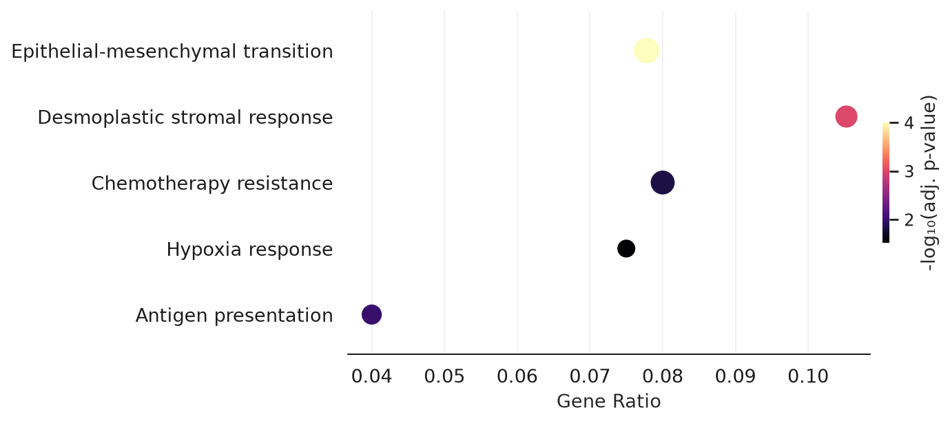
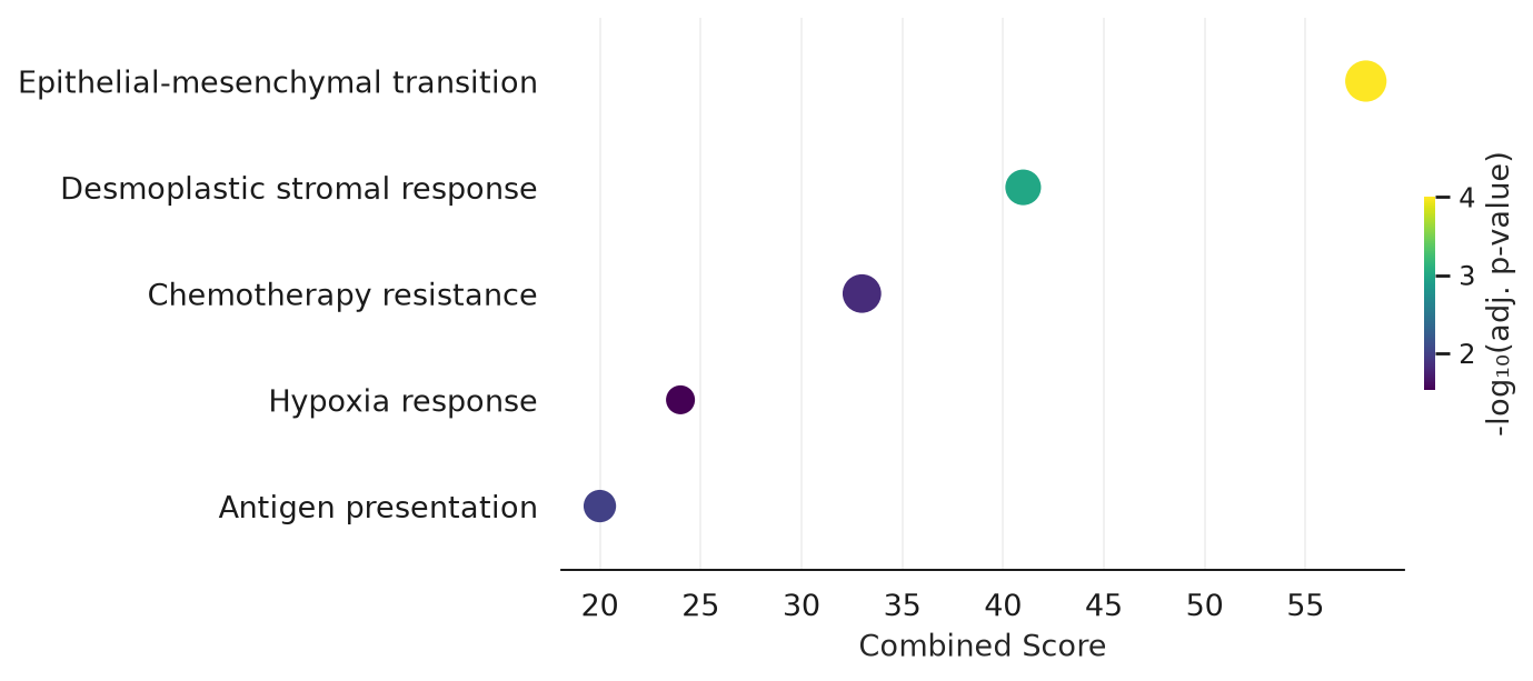
Over-representation analysis results (e.g. from Enrichr/gseapy) as a dot plot: dot size = overlap genes,
color = significance. The atlas itself doesn’t ship an enrichment result, so this cell writes out a small
synthetic CSV in the expected format, with PDAC-relevant term names, purely to demonstrate the plot. Two
demonstrations: the default x_metric="gene_ratio", and x_metric="combined_score" with a different
colormap.
import pandas as pd

ora_results = pd.DataFrame({
    "Gene_set": ["GO_Biological_Process"] * 6,
    "Term": [
        "Epithelial-mesenchymal transition", "Desmoplastic stromal response", "Antigen presentation",
        "Chemotherapy resistance", "Hypoxia response", "Ribosome biogenesis",
    ],
    "Overlap": ["14/180", "10/95", "8/200", "12/150", "6/80", "3/500"],
    "Adjusted P-value": [0.0001, 0.001, 0.01, 0.015, 0.03, 0.6],
    "Odds Ratio": [4.5, 3.9, 2.0, 2.6, 2.1, 0.8],
    "Combined Score": [58, 41, 20, 33, 24, 5],
})
ora_results.to_csv("figures/ora_results.csv", index=False)

plotter.ora_dotplot("figures/ora_results.csv", save_name="ora_dotplot")
Figure saved to: figures/ora/ora_dotplot.png
x_metric="combined_score" instead of the default gene ratio, with cmap="viridis".
plotter.ora_dotplot(
    "figures/ora_results.csv",
    x_metric="combined_score",
    cmap="viridis",
    save_name="ora_dotplot_combined_score",
)
Figure saved to: figures/ora/ora_dotplot_combined_score.png
Next steps#
See Embeddings for UMAP-based plots, or API Reference for the full parameter reference of every function used across all five demonstration notebooks.