
Overview#
Third of five demonstration notebooks – this one covers dataset overview plots:
sample_and_cell_counts_barplot (and its broken-axis variant), cells_per_patient_boxplot,
cell_abundance_barplot, compare_cell_abundance_barplot, and compare_cell_abundance_boxplot.
Data: the same PDAC atlas subset used throughout this set of notebooks (Lucarelli et al., https://doi.org/10.64898/2026.03.19.712924). See Composition for composition plots, Markers & expression for marker-gene and pseudobulk plots, or API Reference for the complete parameter reference.
import anndata as ad
import scanpy as sc

import scplotkit as spk

sc.settings.verbosity = 1

ATLAS_PATH = "/data/Daniele/atlases/final_versions_topublish/Human_subsampled.zarr"
Load the atlas#
adata = ad.read_zarr(ATLAS_PATH)
adata
AnnData object with n_obs × n_vars = 100000 × 39041
    obs: 'Sample_ID', 'Condition', 'Treatment', 'TreatmentType', 'TreatmentStatus', 'Tissue', 'Sex', 'Dataset', 'Technology', 'Level_1', 'Level_2', 'Level_3', 'Level_4', 'Age', 'Diabetes', 'Is_Core', 'EMT category', 'Dataset_ID', 'Cluster_Names'
    var: 'n_cells', 'ensembl_id', 'start', 'end', 'chromosome', 'gene_name_adata_sc', 'highly_variable_adata_sc', 'means_adata_sc', 'dispersions_adata_sc', 'dispersions_norm_adata_sc', 'highly_variable_nbatches_adata_sc', 'highly_variable_intersection_adata_sc', 'n_cells_by_counts_adata_sc', 'mean_counts_adata_sc', 'log1p_mean_counts_adata_sc', 'pct_dropout_by_counts_adata_sc', 'total_counts_adata_sc', 'log1p_total_counts_adata_sc', 'mito_adata_sc', 'n_cells_by_counts_adata_sn', 'mean_counts_adata_sn', 'log1p_mean_counts_adata_sn', 'pct_dropout_by_counts_adata_sn', 'total_counts_adata_sn', 'log1p_total_counts_adata_sn', 'Manual_Genes', 'mt', 'ribo', 'hb'
    uns: 'UMAP_0.85', 'Condition_colors', 'umap', 'Level_3_colors', 'UMAP_0.75', 'Is_Core_colors', '_scvi_manager_uuid', 'neighbors', '_scvi_uuid', 'Level_4_colors', 'Level_2_colors', 'Level_4_All_colors', 'Level_1_colors', 'Level_4_Final_colors'
    obsm: 'log_counts', 'X_pca', 'is_outlier_total_counts', 'scanvi_extended_atlas_emb', 'pct_counts_mito', 'bin_edges', 'level0_leiden_subcluster', 'scanvi_L4_emb', 'n_genes_by_counts', '_scvi_batch', 'UMAP_0.85', 'log1p_n_genes_by_counts', 'leiden_0.2_annotation', 'scANVI_cross_species', 'outlier', 'total_counts', 'batch', 'UMAP_0.75', 'log1p_total_counts', 'n_genes', 'total_counts_mito', 'EMT_score_DL', 'leiden', 'Global_Leiden', 'X_umap', 'MALAT1_lognorm', 'UMAP_0.95', 'infercnv_score_malignant', 'log1p_total_counts_mito', 'leiden_0.2', 'cnv_score_abs', 'scANVI_emb_final', 'EMT score', 'leiden_subcluster', 'empty_droplet', 'leiden_0.5', 'mt_frac', 'n_counts', 'infercnv_score_malignant_refined', '_scvi_labels'
    layers: 'raw', 'counts', 'log_norm'
    obsp: 'connectivities', 'distances'
Set up the plotter#
config = spk.PlotConfig({
    "palettes": {
        "Level_2": {
            "Lymphoid": "#1f78b4",
            "Malignant Cell": "#e31a1c",
            "Stromal Cell": "#33a02c",
            "Myeloid": "#ff7f00",
            "Endothelial Cell": "#6a3d9a",
            "Exocrine Cell": "#b15928",
            "Endocrine Cell": "#a6cee3",
        },
        "TreatmentStatus": {"Untreated": "#4daf4a", "Treated": "#984ea3"},
    }
})
plotter = spk.ScPlotter(config=config, output_dir="figures")
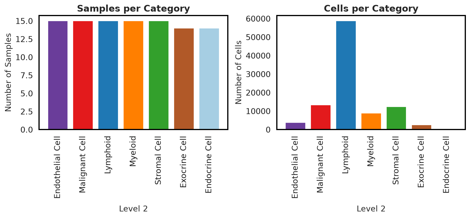
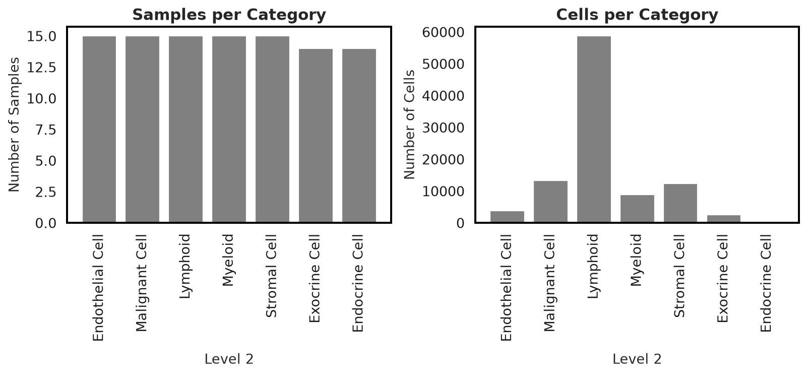
sample_and_cell_counts_barplot#
Side-by-side bars of samples-per-category and cells-per-category; every call also returns a grayscale twin for print-safe figures.
plotter.sample_and_cell_counts_barplot(adata, level_column="Level_2", sample_column="Sample_ID")
(<Figure size 800x400 with 2 Axes>, <Figure size 800x400 with 2 Axes>)
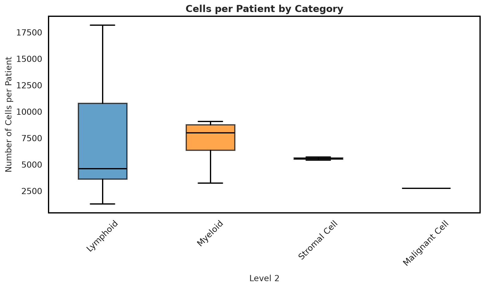
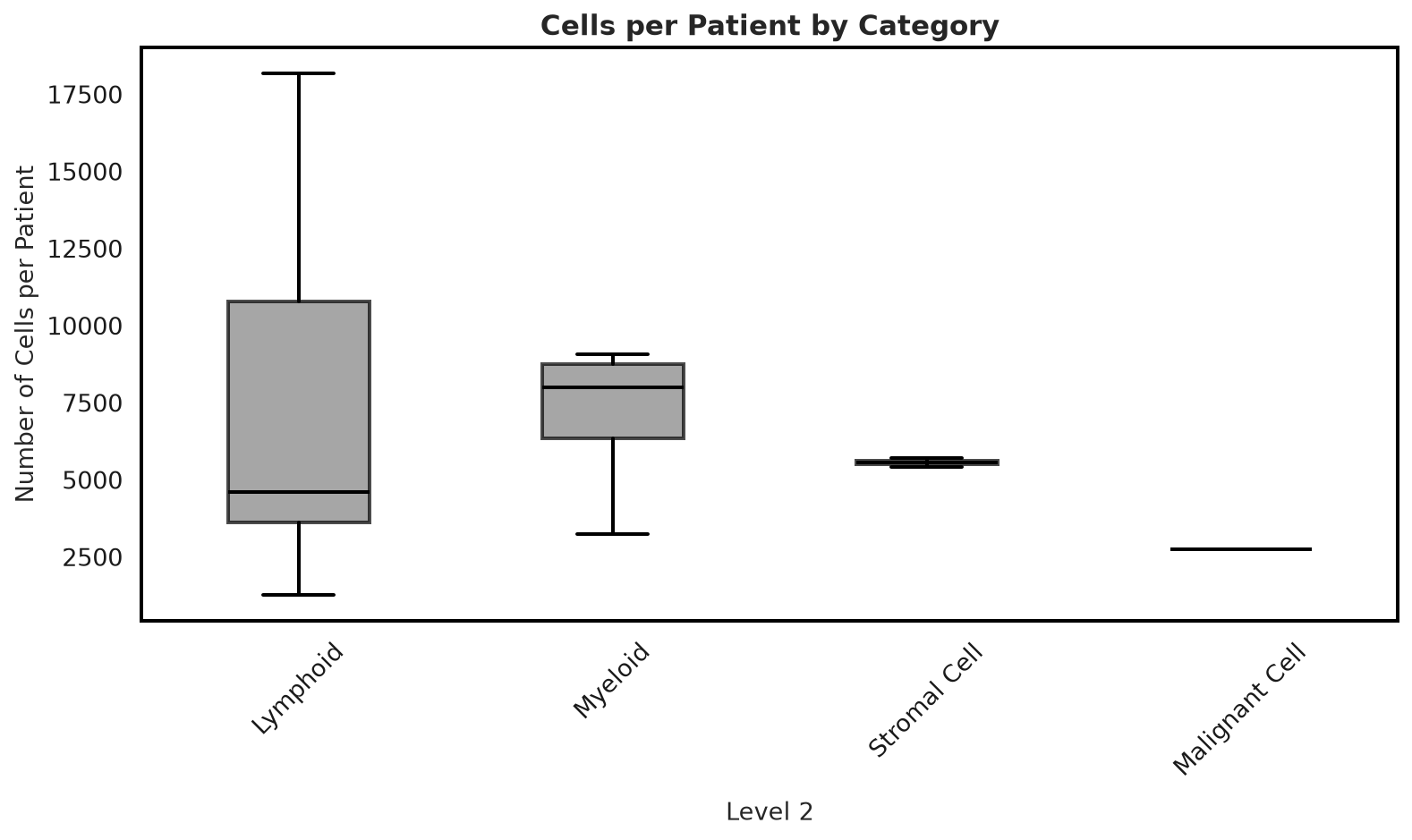
cells_per_patient_boxplot#
Distribution of cells-per-patient, grouped by category.
plotter.cells_per_patient_boxplot(adata, level_column="Level_2", sample_column="Sample_ID")
(<Figure size 800x480 with 1 Axes>, <Figure size 800x480 with 1 Axes>)
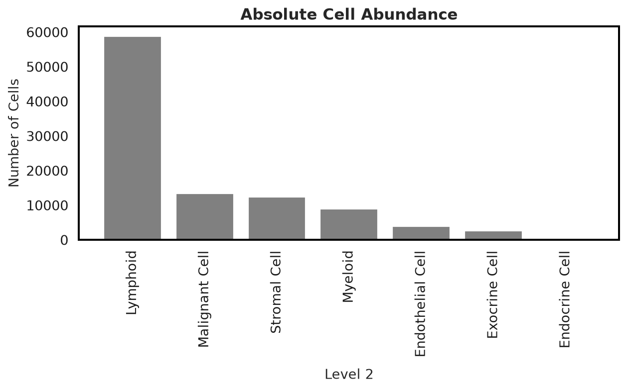
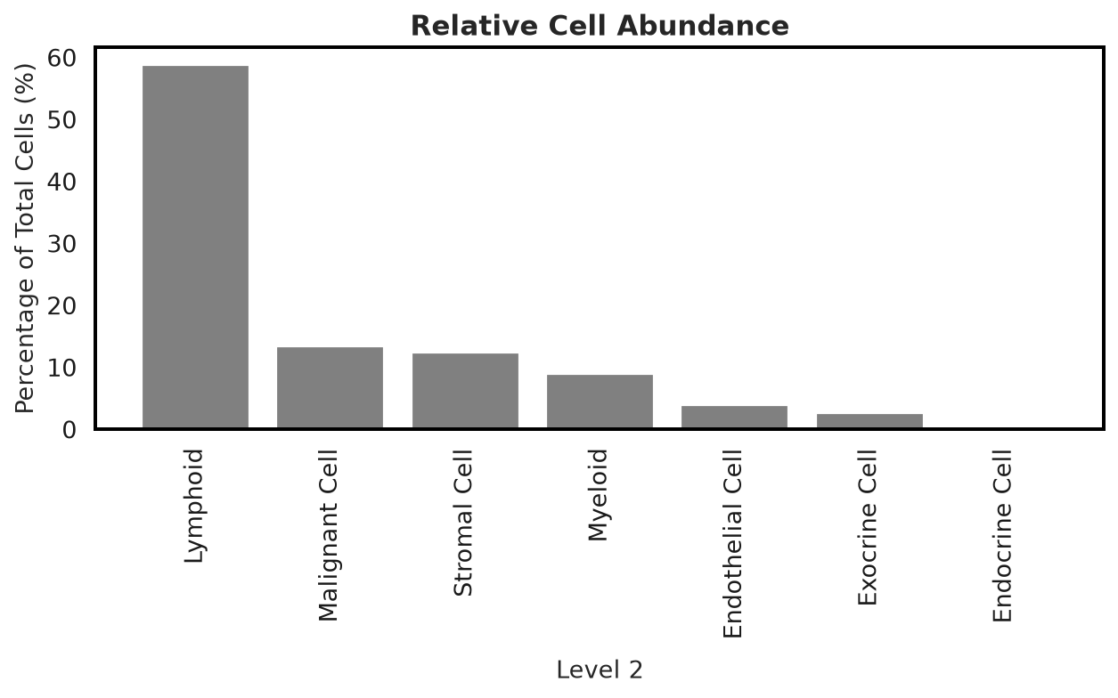
cell_abundance_barplot#
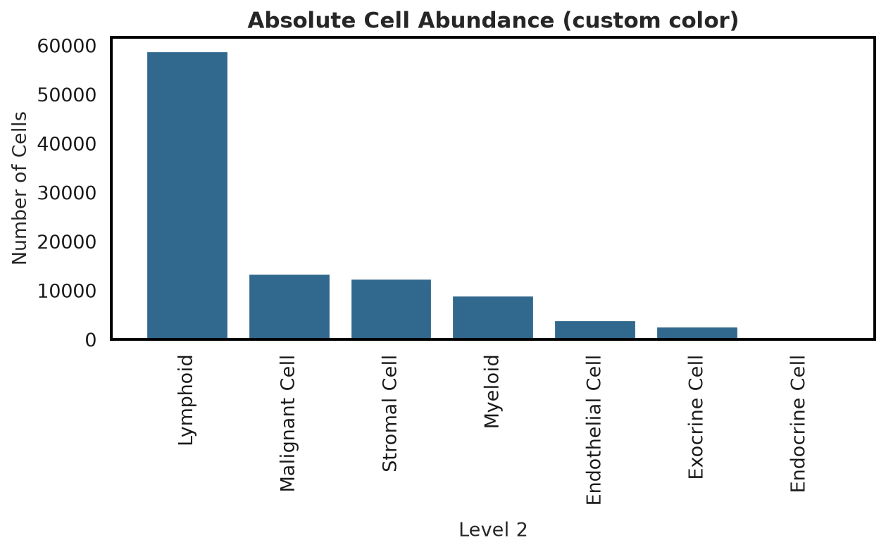
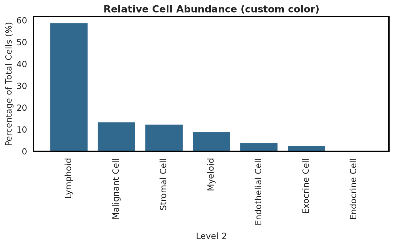
Absolute and relative cell-count bars for one column. Two demonstrations: the default neutral grey, and a
custom color.
plotter.cell_abundance_barplot(adata, cell_type_column="Level_2", save_name="abundance")
Figure saved to: figures/cell_abundance_barplot/abundance_absolute_counts.png
Figure saved to: figures/cell_abundance_barplot/abundance_relative_abundance.png
(<Figure size 640x400 with 1 Axes>, <Figure size 640x400 with 1 Axes>)
plotter.cell_abundance_barplot(
    adata,
    cell_type_column="Level_2",
    color="#31688e",
    title_suffix=" (custom color)",
    save_name="abundance_custom_color",
)
Figure saved to: figures/cell_abundance_barplot/abundance_custom_color_absolute_counts.png
Figure saved to: figures/cell_abundance_barplot/abundance_custom_color_relative_abundance.png
(<Figure size 640x400 with 1 Axes>, <Figure size 640x400 with 1 Axes>)
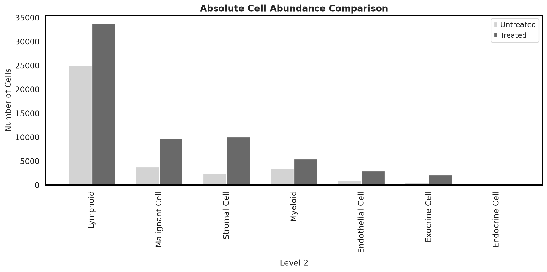
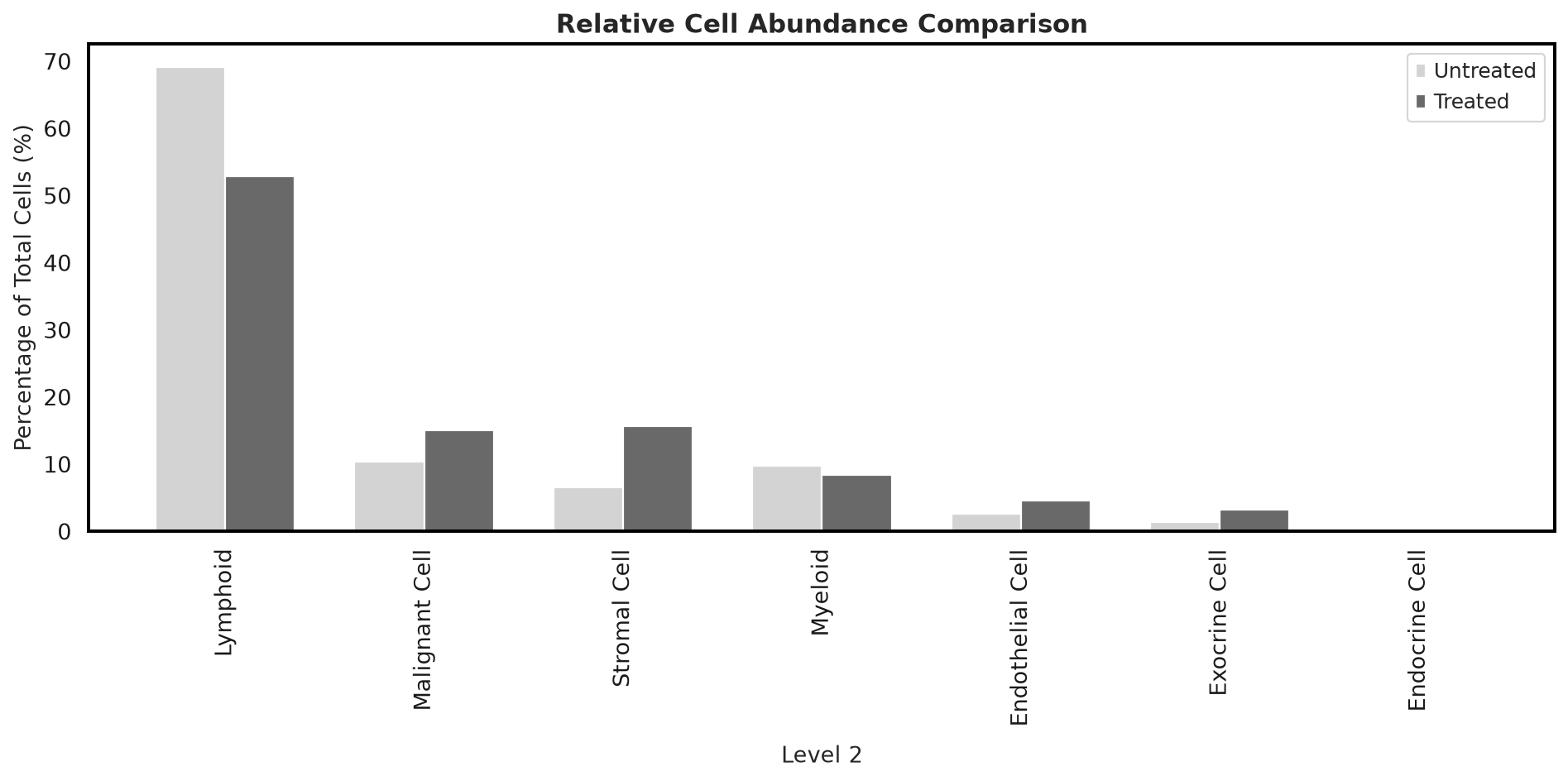
compare_cell_abundance_barplot#
Grouped bars comparing cell-type abundance between two datasets/subsets – here, real treated vs. untreated patients.
untreated = adata[adata.obs["TreatmentStatus"] == "Untreated"].copy()
treated = adata[adata.obs["TreatmentStatus"] == "Treated"].copy()
plotter.compare_cell_abundance_barplot(
    untreated, treated, cell_type_column="Level_2", label1="Untreated", label2="Treated", save_name="compare",
)
Figure saved to: figures/cell_abundance_barplot/compare_absolute_counts_comparison.png
Figure saved to: figures/cell_abundance_barplot/compare_relative_abundance_comparison.png
(<Figure size 960x480 with 1 Axes>, <Figure size 960x480 with 1 Axes>)
compare_cell_abundance_boxplot#
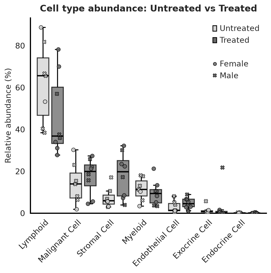
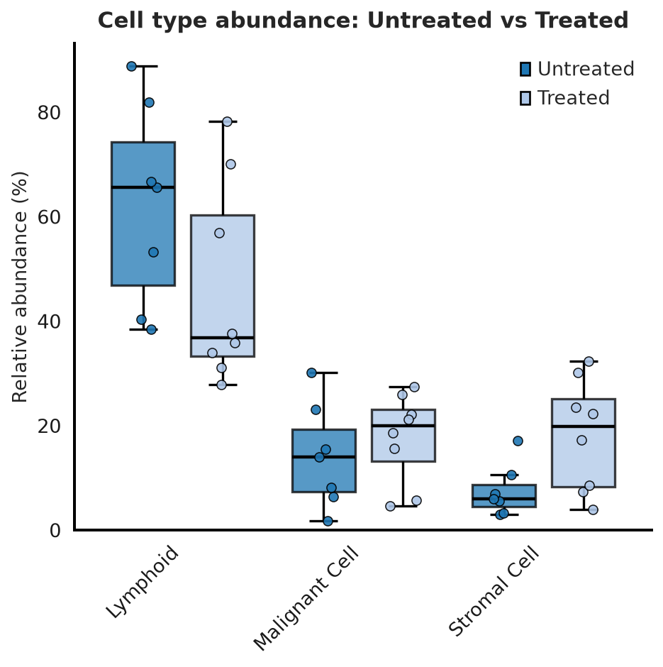
Paired per-sample boxplots (the full per-sample distribution rather than one dataset-wide bar), with
individual sample dots overlaid. Two demonstrations: the default grayscale with point shape mapped to Sex,
and a colored variant restricted to the biggest-difference cell types via high_dif.
plotter.compare_cell_abundance_boxplot(
    untreated,
    treated,
    cell_type_column="Level_2",
    sample_column="Sample_ID",
    label1="Untreated",
    label2="Treated",
    marker_column="Sex",
    figsize=(6, 6),
    save_name="compare_boxplot",
)
Figure saved to: figures/cell_abundance_barplot/compare_boxplot.png
colored=True for distinct dataset colors instead of grayscale, restricted to the 3 cell types with the
largest mean abundance difference via high_dif.
plotter.compare_cell_abundance_boxplot(
    untreated,
    treated,
    cell_type_column="Level_2",
    sample_column="Sample_ID",
    label1="Untreated",
    label2="Treated",
    colored=True,
    high_dif=3,
    figsize=(6, 6),
    save_name="compare_boxplot_high_dif",
)
Figure saved to: figures/cell_abundance_barplot/compare_boxplot_high_dif.png
Next steps#
See Markers & expression for markers & expression plots, or API Reference for the full parameter reference of every function used here.