
Embeddings#
First of five demonstration notebooks showing variations of scplotkit’s major plot families – this one covers
UMAP-based plots: masked_umap, masked_umap_highlight, gene_expression_umap, gene_coexpression_umap,
and embedding_density. Each function is shown with a few different parameter combinations rather than one
canonical call each, so the range of what’s tunable is visible directly in the output instead of only in the
API docs.
Data: a subset of the recently published PDAC atlas by Lucarelli et al. (https://doi.org/10.64898/2026.03.19.712924). See Composition, Overview, Markers & expression, and Hierarchy & enrichment for the other demonstration notebooks, or API Reference for the complete parameter reference.
import anndata as ad
import scanpy as sc

import scplotkit as spk

sc.settings.verbosity = 1

ATLAS_PATH = "/data/Daniele/atlases/final_versions_topublish/Human_subsampled.zarr"
Load the atlas#
adata = ad.read_zarr(ATLAS_PATH)
adata
AnnData object with n_obs × n_vars = 100000 × 39041
    obs: 'Sample_ID', 'Condition', 'Treatment', 'TreatmentType', 'TreatmentStatus', 'Tissue', 'Sex', 'Dataset', 'Technology', 'Level_1', 'Level_2', 'Level_3', 'Level_4', 'Age', 'Diabetes', 'Is_Core', 'EMT category', 'Dataset_ID', 'Cluster_Names'
    var: 'n_cells', 'ensembl_id', 'start', 'end', 'chromosome', 'gene_name_adata_sc', 'highly_variable_adata_sc', 'means_adata_sc', 'dispersions_adata_sc', 'dispersions_norm_adata_sc', 'highly_variable_nbatches_adata_sc', 'highly_variable_intersection_adata_sc', 'n_cells_by_counts_adata_sc', 'mean_counts_adata_sc', 'log1p_mean_counts_adata_sc', 'pct_dropout_by_counts_adata_sc', 'total_counts_adata_sc', 'log1p_total_counts_adata_sc', 'mito_adata_sc', 'n_cells_by_counts_adata_sn', 'mean_counts_adata_sn', 'log1p_mean_counts_adata_sn', 'pct_dropout_by_counts_adata_sn', 'total_counts_adata_sn', 'log1p_total_counts_adata_sn', 'Manual_Genes', 'mt', 'ribo', 'hb'
    uns: 'Condition_colors', 'UMAP_0.85', 'Level_3_colors', 'umap', '_scvi_manager_uuid', 'Is_Core_colors', 'Level_4_colors', 'neighbors', 'UMAP_0.75', '_scvi_uuid', 'Level_2_colors', 'Level_1_colors', 'Level_4_Final_colors', 'Level_4_All_colors'
    obsm: 'log_counts', 'is_outlier_total_counts', 'X_pca', 'pct_counts_mito', 'scanvi_extended_atlas_emb', 'UMAP_0.85', 'bin_edges', 'scanvi_L4_emb', 'scANVI_cross_species', 'level0_leiden_subcluster', '_scvi_batch', 'leiden_0.2_annotation', 'n_genes_by_counts', 'log1p_total_counts', 'batch', 'n_genes', 'total_counts', 'outlier', 'log1p_n_genes_by_counts', 'leiden', 'EMT_score_DL', 'X_umap', 'total_counts_mito', 'Global_Leiden', 'UMAP_0.75', 'MALAT1_lognorm', 'infercnv_score_malignant', 'log1p_total_counts_mito', 'UMAP_0.95', 'leiden_0.5', 'leiden_0.2', 'EMT score', 'scANVI_emb_final', 'cnv_score_abs', 'leiden_subcluster', 'empty_droplet', 'n_counts', 'mt_frac', 'infercnv_score_malignant_refined', '_scvi_labels'
    layers: 'raw', 'log_norm', 'counts'
    obsp: 'distances', 'connectivities'
Set up the plotter#
config = spk.PlotConfig({
    "palettes": {
        "Level_2": {
            "Lymphoid": "#1f78b4",
            "Malignant Cell": "#e31a1c",
            "Stromal Cell": "#33a02c",
            "Myeloid": "#ff7f00",
            "Endothelial Cell": "#6a3d9a",
            "Exocrine Cell": "#b15928",
            "Endocrine Cell": "#a6cee3",
        },
        "TreatmentStatus": {"Untreated": "#4daf4a", "Treated": "#984ea3"},
    }
})
plotter = spk.ScPlotter(config=config, output_dir="figures")
masked_umap#
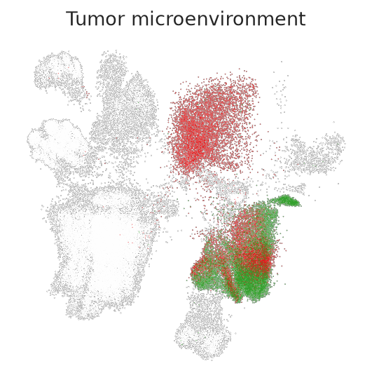
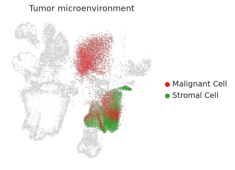
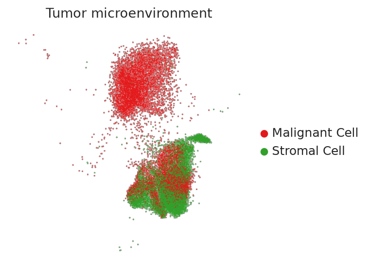
Colors color_by categories inside mask_values, greying out everything else (a third, subset-only variant
is also saved by every call). Two variations: a broad multi-category mask, and a compartment made up of
several smaller Level_3 subtypes – see masked_umap_highlight below for populations that are hard to spot
without enlarging them first.
plotter.masked_umap(
    adata,
    color_by="Level_2",
    mask_values=["Malignant Cell", "Stromal Cell"],
    figure_name="Tumor microenvironment",
    show=True,
)
WARNING: saving figure to file figures/Tumor_microenvironment/umap_Tumor_microenvironment_masked_colored_Level_2.png
WARNING: saving figure to file figures/Tumor_microenvironment/umap_Tumor_microenvironment_masked_colored_Level_2_legend.png
WARNING: saving figure to file figures/Tumor_microenvironment/umap_Tumor_microenvironment_subset_only_Level_2_legend.png
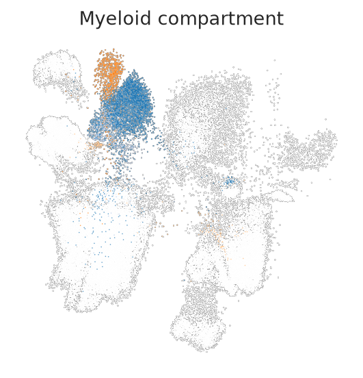
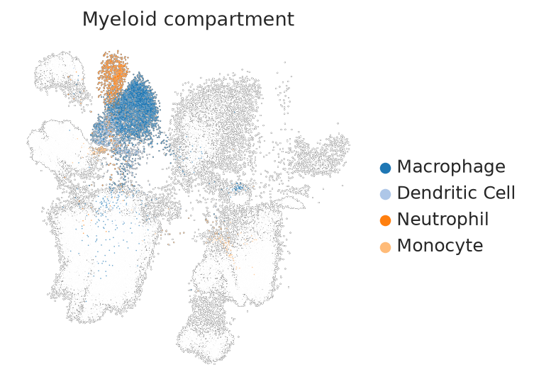
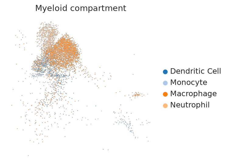
The myeloid compartment at Level_3 resolution (macrophages, dendritic cells, neutrophils, monocytes) –
several distinct subtypes grouped into one mask.
plotter.masked_umap(
    adata,
    color_by="Level_3",
    mask_values=["Macrophage", "Dendritic Cell", "Neutrophil", "Monocyte"],
    figure_name="Myeloid compartment",
    show=True,
    size=2
)
WARNING: saving figure to file figures/Myeloid_compartment/umap_Myeloid_compartment_masked_colored_Level_3.png
WARNING: saving figure to file figures/Myeloid_compartment/umap_Myeloid_compartment_masked_colored_Level_3_legend.png
/home/philipp.putze/github_repos/singleplot/.venv/lib/python3.11/site-packages/scanpy/plotting/_tools/scatterplots.py:1148: UserWarning: *c* argument looks like a single numeric RGB or RGBA sequence, which should be avoided as value-mapping will have precedence in case its length matches with *x* & *y*.  Please use the *color* keyword-argument or provide a 2D array with a single row if you intend to specify the same RGB or RGBA value for all points.
  ax.scatter([], [], c=palette[label], label=label)
WARNING: saving figure to file figures/Myeloid_compartment/umap_Myeloid_compartment_subset_only_Level_3_legend.png
/home/philipp.putze/github_repos/singleplot/.venv/lib/python3.11/site-packages/scanpy/plotting/_tools/scatterplots.py:1148: UserWarning: *c* argument looks like a single numeric RGB or RGBA sequence, which should be avoided as value-mapping will have precedence in case its length matches with *x* & *y*.  Please use the *color* keyword-argument or provide a 2D array with a single row if you intend to specify the same RGB or RGBA value for all points.
  ax.scatter([], [], c=palette[label], label=label)
masked_umap_highlight#
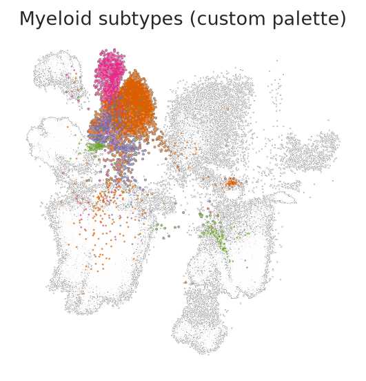
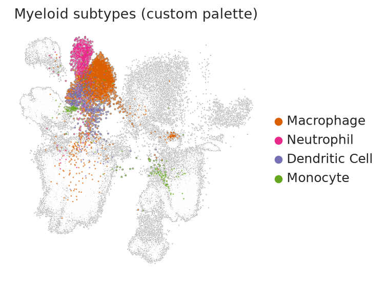
Draws the masked population enlarged on top of a small greyed-out background instead of hiding the rest –
especially useful for populations that are hard to spot with plain masking above, either because they’re
spread across several smaller subtypes or because they’re rare. Four variations: the myeloid subtypes from
above with a custom palette, a rare population (endocrine cells), an extreme highlight/background size
contrast on a single subtype, and a subtle highlight with ordered=False.
plotter.masked_umap_highlight(
    adata,
    color_by="Level_3",
    mask_values=["Macrophage", "Dendritic Cell", "Neutrophil", "Monocyte"],
    figure_name="Myeloid subtypes (custom palette)",
    palette={
        "Macrophage": "#d95f02",
        "Dendritic Cell": "#7570b3",
        "Neutrophil": "#e7298a",
        "Monocyte": "#66a61e",
    },
    highlight_size=6,
    background_size=1.5,
    show=True,
)
WARNING: saving figure to file figures/Myeloid_subtypes_(custom_palette)/umap_Myeloid_subtypes_(custom_palette)_masked_colored_Level_3_6_highlight.png
WARNING: saving figure to file figures/Myeloid_subtypes_(custom_palette)/umap_Myeloid_subtypes_(custom_palette)_masked_colored_Level_3_6_highlight_legend.png
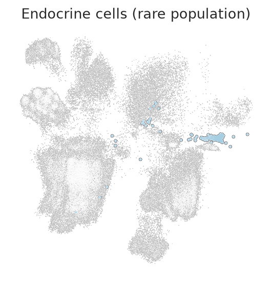
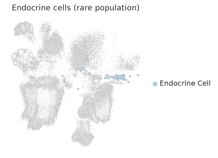
Endocrine cells make up a small fraction of a PDAC atlas – enlarging them makes the population obvious in a way plain masking above does not.
plotter.masked_umap_highlight(
    adata,
    color_by="Level_2",
    mask_values=["Endocrine Cell"],
    figure_name="Endocrine cells (rare population)",
    highlight_size=20,
    background_size=0.5,
    show=True,
)
WARNING: saving figure to file figures/Endocrine_cells_(rare_population)/umap_Endocrine_cells_(rare_population)_masked_colored_Level_2_20_highlight.png
WARNING: saving figure to file figures/Endocrine_cells_(rare_population)/umap_Endocrine_cells_(rare_population)_masked_colored_Level_2_20_highlight_legend.png
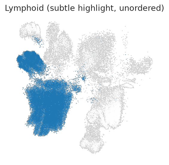
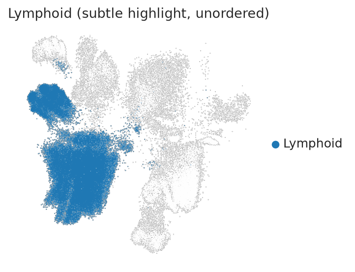
A subtler highlight (sizes close together) with ordered=False, so highlighted and background cells are
drawn in their original row order instead of highlighted-on-top – some highlighted cells can end up covered
by background ones.
plotter.masked_umap_highlight(
    adata,
    color_by="Level_2",
    mask_values=["Lymphoid"],
    figure_name="Lymphoid (subtle highlight, unordered)",
    highlight_size=2.5,
    background_size=1.5,
    ordered=False,
    show=True,
)
WARNING: saving figure to file figures/Lymphoid_(subtle_highlight,_unordered)/umap_Lymphoid_(subtle_highlight,_unordered)_masked_colored_Level_2_2.5_highlight.png
WARNING: saving figure to file figures/Lymphoid_(subtle_highlight,_unordered)/umap_Lymphoid_(subtle_highlight,_unordered)_masked_colored_Level_2_2.5_highlight_legend.png
gene_expression_umap#
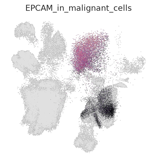
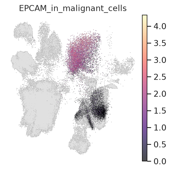
Expression of one gene on the embedding, optionally masked to a subset of cells. Four variations covering
colormap choice and value scaling: the default sequential colormap with an automatic scale, a different
sequential colormap with percentile-based clipping, a diverging colormap on a masked subset, and manually
fixed vmin/vmax.
plotter.gene_expression_umap(
    adata,
    gene="EPCAM",
    layer="log_norm",
    mask_column="Level_2",
    mask_values=["Malignant Cell"],
    figure_name="EPCAM_in_malignant_cells",
    show=True,
)
Masking applied: showing EPCAM only in ['Malignant Cell']
WARNING: saving figure to file figures/EPCAM_in_malignant_cells/umap_EPCAM_in_malignant_cells_EPCAM_masked_Level_2.png
WARNING: saving figure to file figures/EPCAM_in_malignant_cells/umap_EPCAM_in_malignant_cells_EPCAM_masked_Level_2_with_colorbar.png
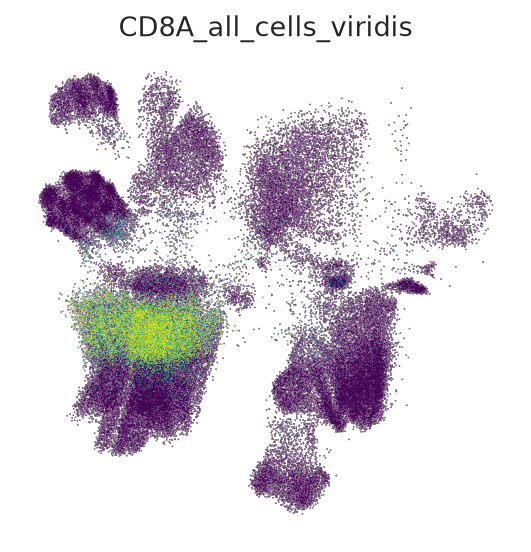
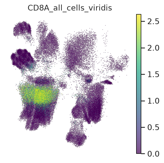
cmap="viridis" over the whole atlas (no mask), with vmax="p99" clipping the top percentile of expression
so a handful of very high cells don’t wash out the rest of the scale.
plotter.gene_expression_umap(
    adata,
    gene="CD8A",
    layer="log_norm",
    cmap="viridis",
    vmax="p99",
    figure_name="CD8A_all_cells_viridis",
    show=True,
)
WARNING: saving figure to file figures/CD8A_all_cells_viridis/umap_CD8A_all_cells_viridis_CD8A_all_cells.png
WARNING: saving figure to file figures/CD8A_all_cells_viridis/umap_CD8A_all_cells_viridis_CD8A_all_cells_with_colorbar.png
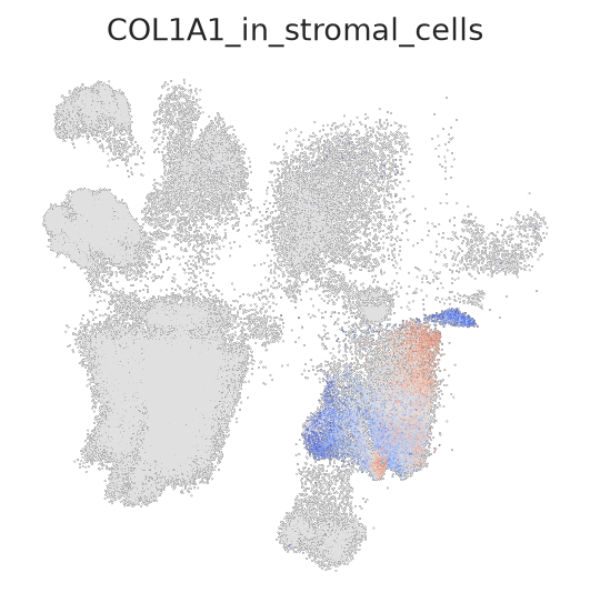
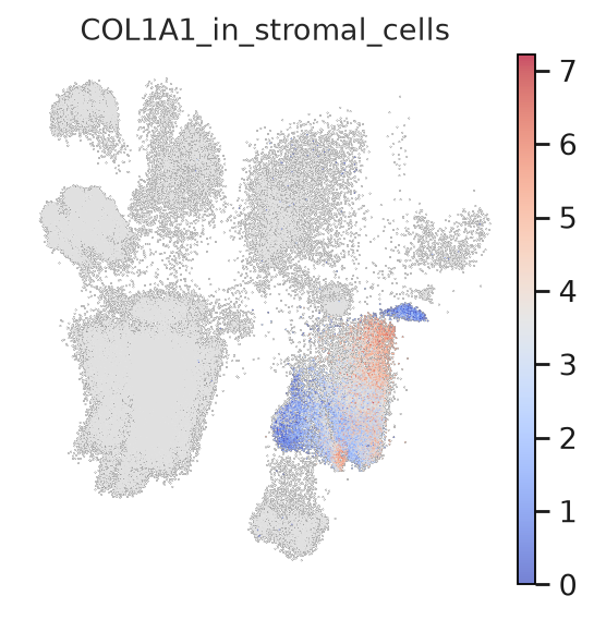
A diverging colormap (coolwarm) on a masked subset – diverging colormaps are usually reserved for signed
values (e.g. log fold change), but work here too as a higher-contrast alternative to a sequential one.
plotter.gene_expression_umap(
    adata,
    gene="COL1A1",
    layer="log_norm",
    mask_column="Level_2",
    mask_values=["Stromal Cell"],
    cmap="coolwarm",
    figure_name="COL1A1_in_stromal_cells",
    show=True,
)
Masking applied: showing COL1A1 only in ['Stromal Cell']
WARNING: saving figure to file figures/COL1A1_in_stromal_cells/umap_COL1A1_in_stromal_cells_COL1A1_masked_Level_2.png
WARNING: saving figure to file figures/COL1A1_in_stromal_cells/umap_COL1A1_in_stromal_cells_COL1A1_masked_Level_2_with_colorbar.png
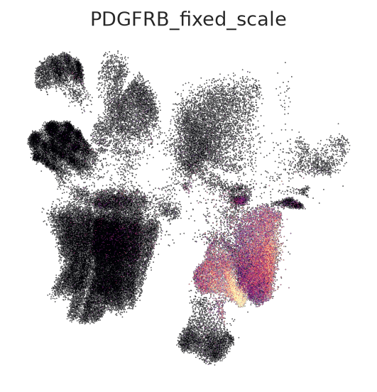
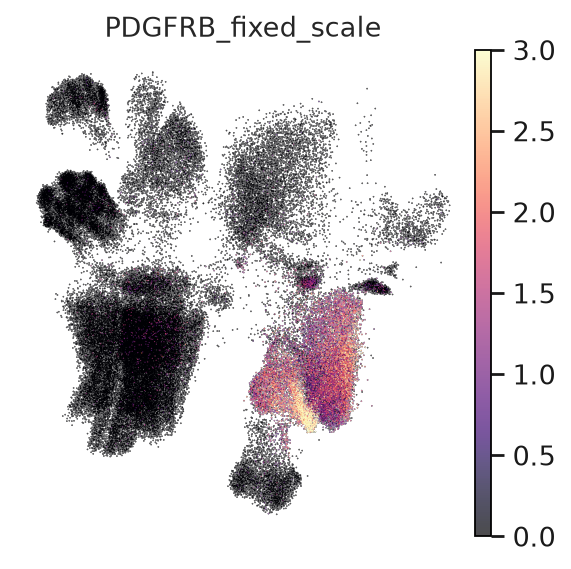
Manually fixed vmin/vmax instead of the percentile-based default – useful when comparing the same gene
across multiple figures/panels that need an identical color scale.
plotter.gene_expression_umap(
    adata,
    gene="PDGFRB",
    layer="log_norm",
    vmin=0,
    vmax=3,
    figure_name="PDGFRB_fixed_scale",
    show=True,
)
WARNING: saving figure to file figures/PDGFRB_fixed_scale/umap_PDGFRB_fixed_scale_PDGFRB_all_cells.png
WARNING: saving figure to file figures/PDGFRB_fixed_scale/umap_PDGFRB_fixed_scale_PDGFRB_all_cells_with_colorbar.png
gene_coexpression_umap#
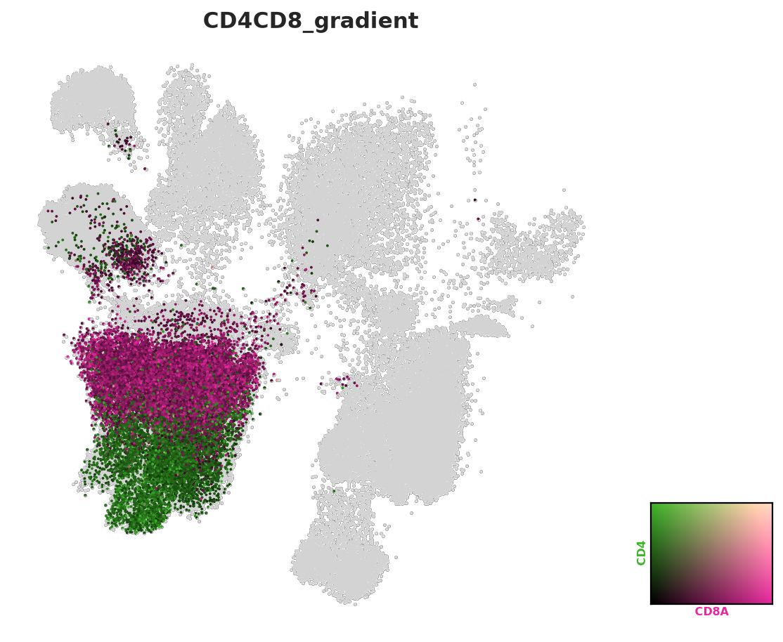
Blends two genes’ normalized expression into one bivariate color per cell. Three variations: the default
magenta/green blend, a custom color pair on a different marker duo, and a variant tuned via threshold/
point_size/add_outline.
Each call ends with a ; – the function both shows the figure itself (show=True) and returns it, and
without the ; Jupyter’s automatic display of the cell’s last expression would render the same (already
shown) figure a second time.
plotter.gene_coexpression_umap(
    adata,
    gene1="CD8A",
    gene2="CD4",
    layer="log_norm",
    mask_column="Level_2",
    mask_values=["Lymphoid"],
    figure_name="CD4CD8_gradient",
    show=True,
);
Masking applied: showing CD8A/CD4 co-expression only in ['Lymphoid']
Figure saved to: figures/CD4CD8_gradient/CD4CD8_gradient_CD8A_CD4_coexpression.png
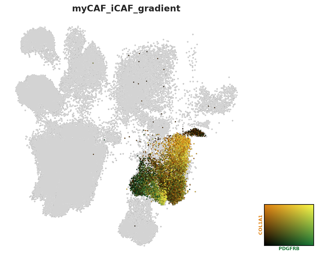
Custom color1/color2 for the myCAF (PDGFRB-high) vs. iCAF (COL1A1-only) fibroblast distinction within
the stromal compartment.
plotter.gene_coexpression_umap(
    adata,
    gene1="PDGFRB",
    gene2="COL1A1",
    color1="#1b7837",
    color2="#e08214",
    layer="log_norm",
    mask_column="Level_2",
    mask_values=["Stromal Cell"],
    figure_name="myCAF_iCAF_gradient",
    show=True,
);
Masking applied: showing PDGFRB/COL1A1 co-expression only in ['Stromal Cell']
Figure saved to: figures/myCAF_iCAF_gradient/myCAF_iCAF_gradient_PDGFRB_COL1A1_coexpression.png
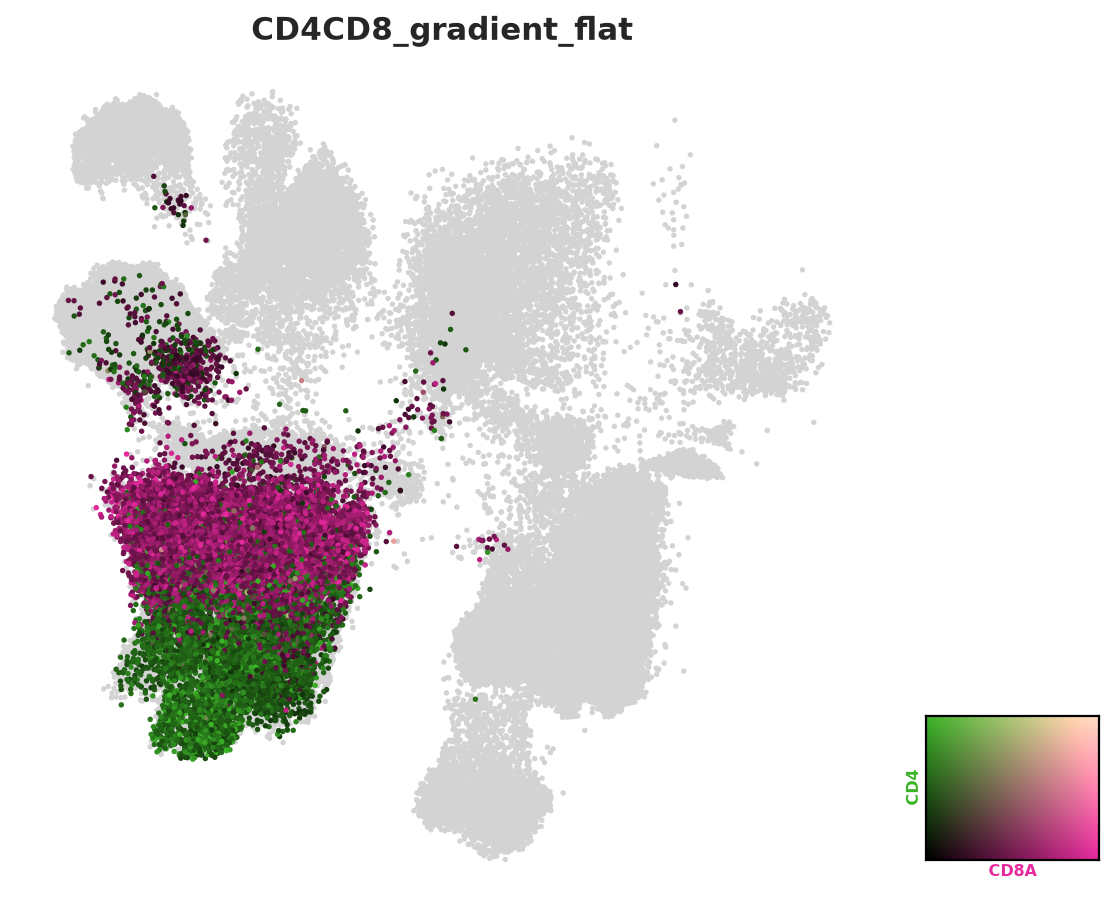
Same CD4/CD8 pair, but with a lower threshold (fewer cells drop out to grey), a fixed point_size, and
add_outline=False for a flatter look on a dense embedding.
plotter.gene_coexpression_umap(
    adata,
    gene1="CD8A",
    gene2="CD4",
    layer="log_norm",
    mask_column="Level_2",
    mask_values=["Lymphoid"],
    threshold=0.02,
    point_size=6,
    add_outline=False,
    figure_name="CD4CD8_gradient_flat",
    show=True,
);
Masking applied: showing CD8A/CD4 co-expression only in ['Lymphoid']
Figure saved to: figures/CD4CD8_gradient_flat/CD4CD8_gradient_flat_CD8A_CD4_coexpression.png
embedding_density#
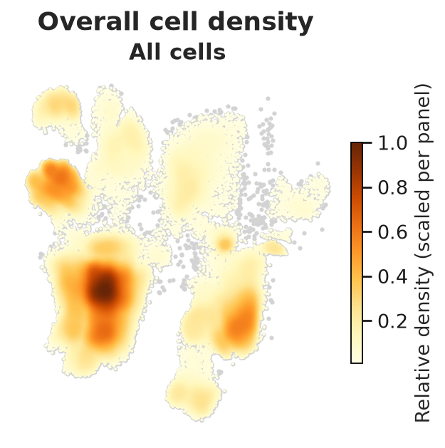
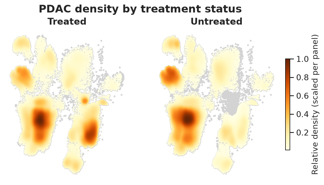
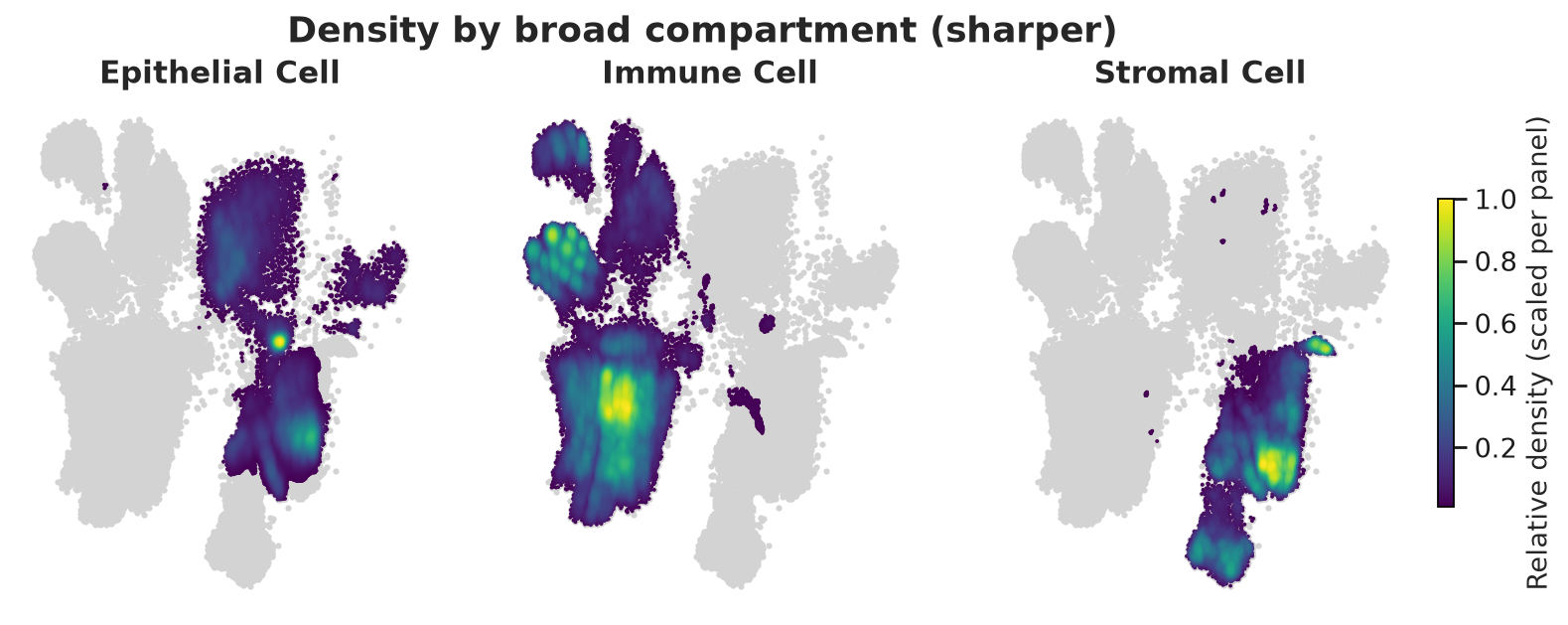
Per-cell density, optionally one panel per group. Three variations: a single overall panel, grouped by
TreatmentStatus, and grouped by a broader column with a different colormap and a sharper bandwidth. As
above, each call ends with a ; to avoid a duplicate render of the already-shown figure.
plotter.embedding_density(
    adata,
    figure_name="Overall cell density",
    save_name="density_overall",
    show=True,
);
Figure saved to: figures/embedding_density/density_overall.png
plotter.embedding_density(
    adata,
    groupby="TreatmentStatus",
    figure_name="PDAC density by treatment status",
    save_name="density_by_treatment_status",
    show=True,
);
Figure saved to: figures/embedding_density/density_by_treatment_status.png
Grouped by Level_1 instead, with a different colormap and a sharper (bw_scale) density surface – a lower
bw_scale picks out smaller, more localized hotspots instead of smoothing them into broad regions.
plotter.embedding_density(
    adata,
    groupby="Level_1",
    cmap="viridis",
    bw_scale=0.25,
    figure_name="Density by broad compartment (sharper)",
    save_name="density_by_level1_sharp",
    show=True,
);
Figure saved to: figures/embedding_density/density_by_level1_sharp.png
Next steps#
Every plot above was also written to disk under figures/, one subdirectory per plot family. See Composition for composition plots, or API Reference for the full parameter reference of every function used here.